Tracking payments
Airtasker
April 2016 – June 2016
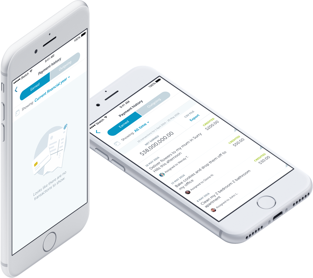
The challenge:
With the end of the financial year coming up, we wanted to add a feature that allowed both our Taskers and Job Posters to track and report their spending and earnings through Airtasker.
Due to engineering availability, this was a mobile-only feature. I worked with our VP of Design, an iOS engineer, an Android engineer, and a backend engineer.
A payment history is straightforward enough. Right?
We mapped out the scenarios that should be covered and the user goals for the feature. From these, I started putting pen to paper to illustrate the ideas and got feedback from our financial controller along with the rest of the team.
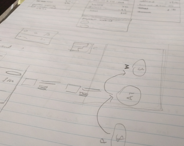
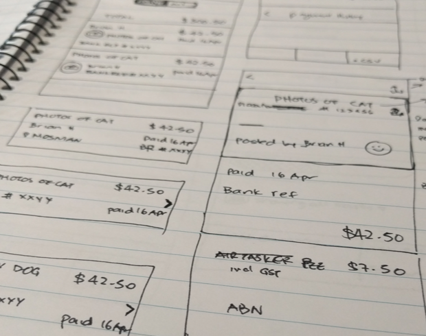
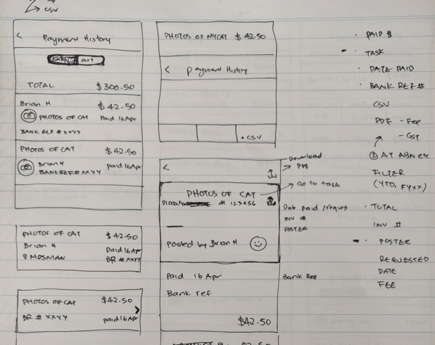
Test as early as you can
While the engineers looked further into the feasibility of some of the proposed functionality, I continued to test with new and existing Airtasker workers.
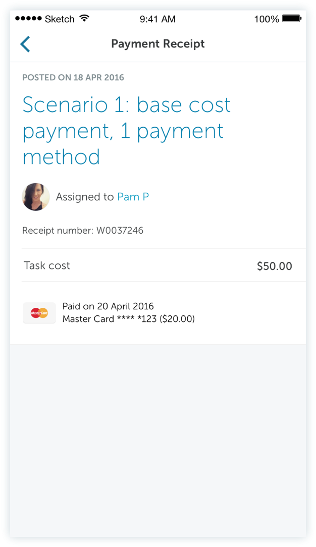
From the usability test, we learned that we had been looking at the problem from a different perspective than our users. We were trying to create a hub for all payment records, but to our users, the receipt belonged with the task while the transaction history was a separate thing.
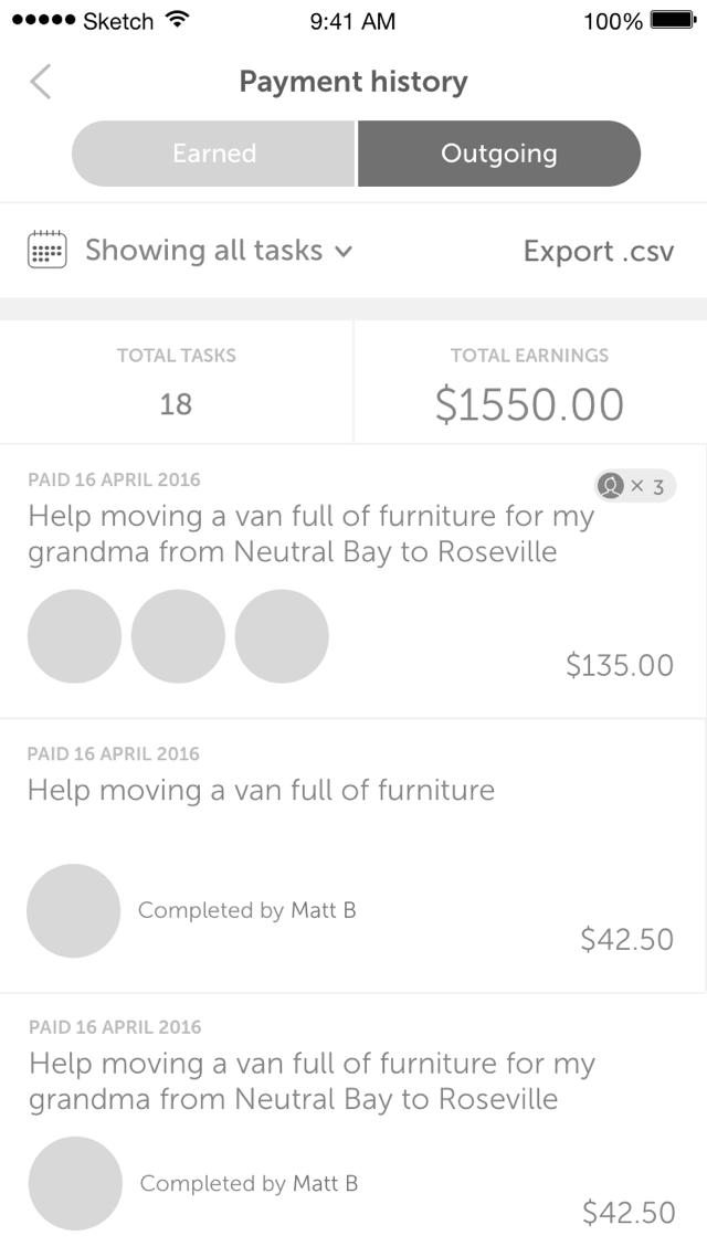

Early visual designs
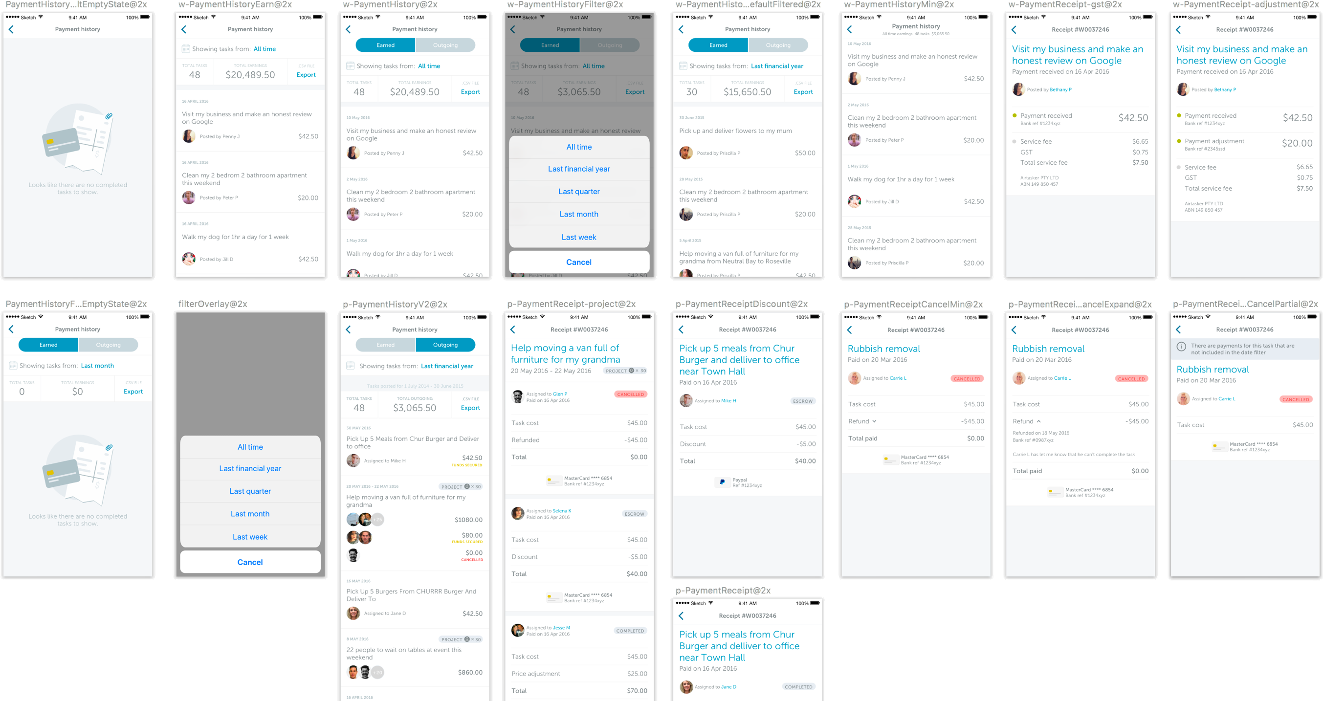
Simplify, simplify, simplify
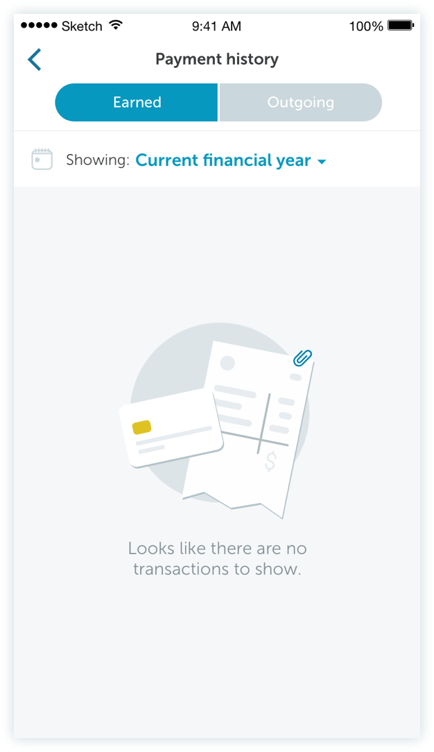
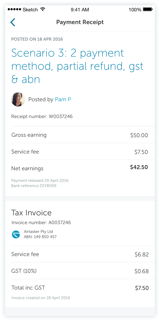
The final UI came together based on feedback from our users, Airtasker customer service representatives, our financial controller, and engineers. Colours, tags, and unnecessary information were stripped away to make the information easier for users to understand.
