Meva Baby
Mevo Group
October 2015 – December 2015

The challenge:
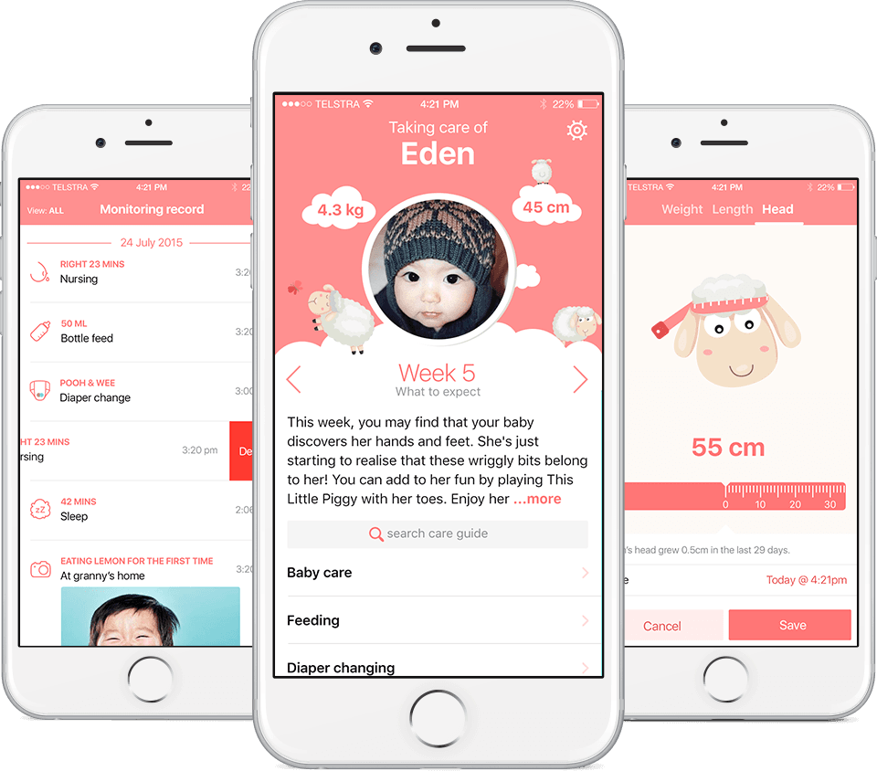
Mevo Group, a Vietnamese Australian startup group, approached Fluency for two design projects: an e-commerce platform for FMCG and a mobile app to assist and educate new mothers in Vietnam. Ultimately, the goal was to connect the two projects together, directing mothers to a trusted source of products for their family.
I worked alongside our UX director and focused on research, interaction design, and visual design for the Meva Baby app.

Explore & understand the goals of our users
We began researching pregnancy and new mothers by looking at market research already conducted by the team and readily available material such as The Blue Book (the Australian health and development book for newborns), baby apps, and speaking to friends and family with a baby or expecting. A workshop was carried out with the stakeholders to discuss what they wanted to achieve in this app and realistically categorize their requirements into phases.
Working with a limited budget meant that we needed to research our users without incurring high expenses. Flying our team out to Hanoi and Ho Chi Minh City was ruled out. Instead, we set up a Facebook group of 20 new mothers in Vietnam to ask questions.

Above: one of the flow diagrams that illustrate how users can move within the app. This helped to make sure we didn't miss anything as well as see how the features all fit together.
Wireframes & interaction spec
Sketches were drawn and the key screens were wireframed to show stakeholders. Once we got the go-ahead I continued with the rest of the screens and used them as the base to create an interaction spec for the developers so they could get started while I moved into the visual design.

Visual design
The brief we received from the clients for visual direction was "Korean Cute".


Final UI
It was time to add in Vietnamese translations and switch to more vibrant colours as requested by the mothers we tested with.

